With the size of spaces people can actually afford to live and work in reducing at astronomical rates, it is important for interior designers to have a handle on (creatively) managing small spaces. The fact that smaller spaces are relatively more sustainable and eco-friendly is also making them increasingly attractive. Every square meter matters so here are a few tips I have picked up along the way….
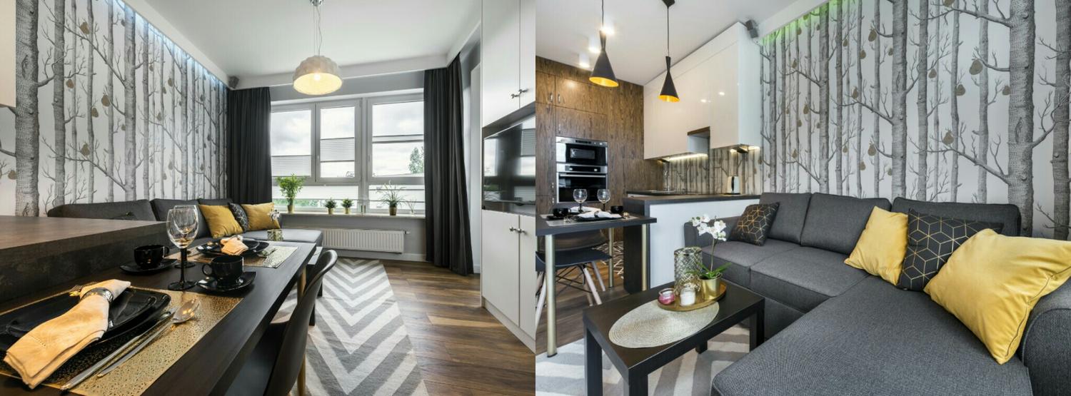
Colour choice: Although all-white colour schemes are a common solution for small spaces, you could also paint walls in a subtle/neutral colour palette such as soft greys, for example, you can add a few other colours on to these. Do remember to keep the palette cohesive though.
Walls: Where possible, taking down walls will create more open space and this will automatically make a room feel bigger. Do remember to ensure there is design cohesion and a sense of flow through the entire space.

Doors: Sliding doors take up less of your space than those requiring room for a swing. They also allow you to open up space when required and still have the option to close rooms off when privacy is needed. Bear in mind here that interesting use of materials on/for the door itself could also become a design feature that is conversation-worthy!
Windows: I have an immense love for natural light! Large windows fill up a space with natural light and automatically make them seem bigger and less pokey. Well placed windows will also visually expand a space by framing views of the outdoors.

Floors: If you’re thinking of floor coverings, use larger rugs. Although this sound counter-intuitive, large rugs can make a small space feel bigger.
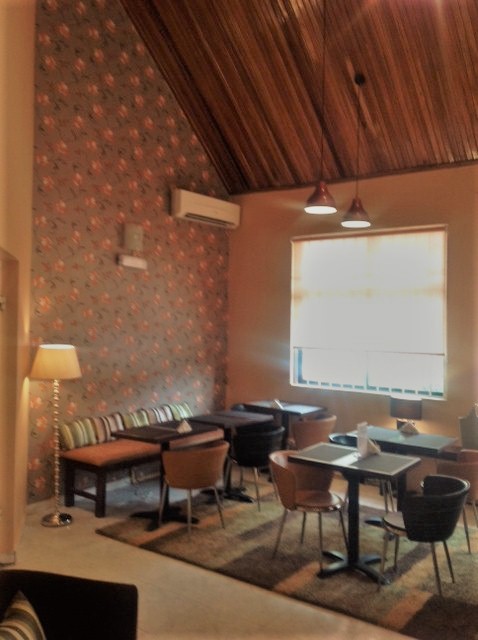
Ceilings: This is an area that cannot be ignored when space is at a premium so hang things! Plants and light fittings can be made more interesting by hanging them from the ceiling. Be deliberate about the exact positioning to avoid mishaps and visual clutter.
Furniture:
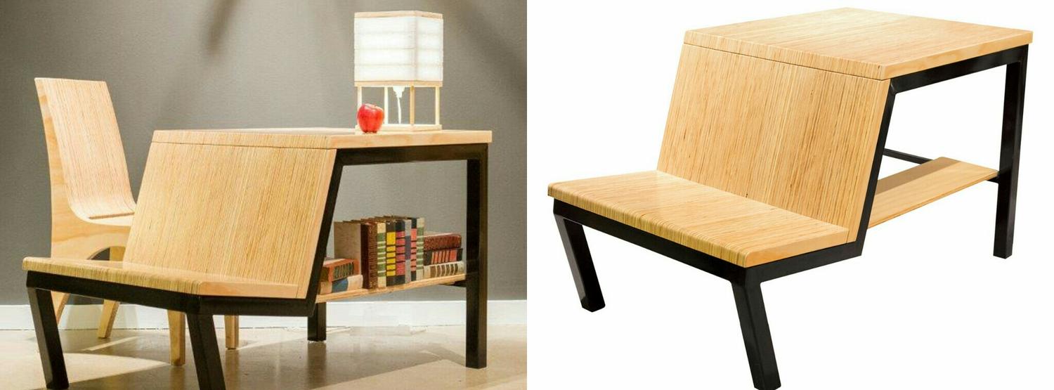
- Use multi-functional furniture to save on space. For example, a piece of furniture that can act as a desk and a bookshelf will automatically reduce the number of elements that need to be in a space. A sofa bed is also another prime example of multi-functional furniture.
- Secondly, floating large pieces trick the eye into thinking less space has been taken up because the floor area is still free e.g. a wall-mounted desk that takes up zero floor space.
- Thirdly, furniture made of a clear material (such as acrylic or glass) are good at “disappearing” whilst present in a space – visual trickery anyone?

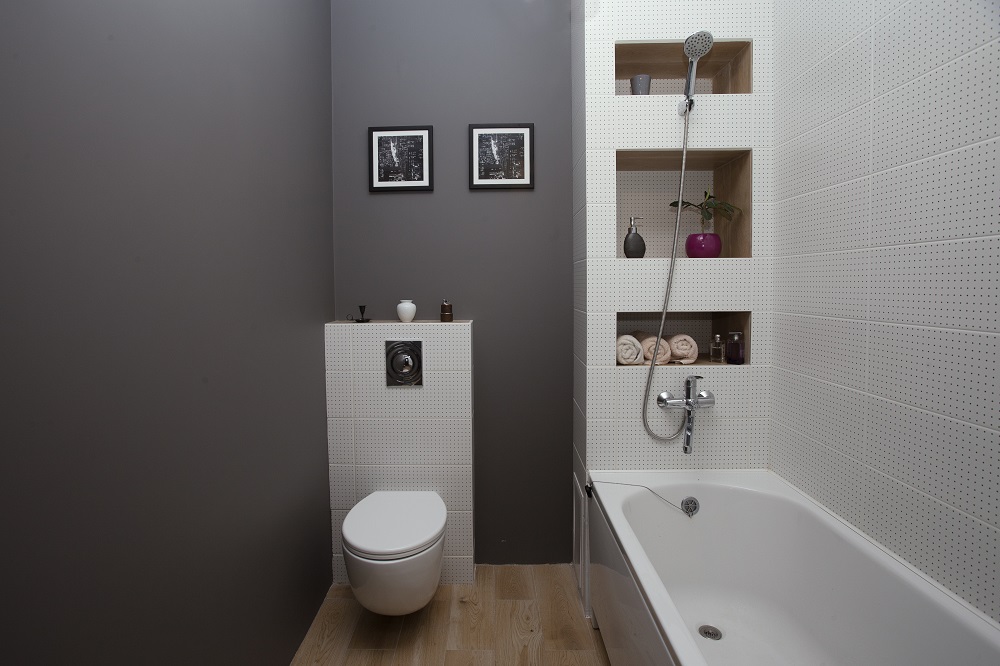
Storage: this is always a major challenge in small spaces. We all have “stuff” so where does it go? Create storage in places that would otherwise be “dead space” such as alcoves in thick walls, under staircases or under beds and awkward corners in rooms; deep window sills are great for books; tuck things (neatly) under coffee tables…

Mirrors: Mirrors, mirrors, mirrors! These are an effortless yet decorative way to make a space look AND feel bigger. Mirrors create the illusion of doubling up on whatever is reflected and remember the mirror not only doubles up items, it doubles up light!


